You would be hard-pressed to find someone more visually inspired by the 80s than Van Orton. The twin brother designers from Italy don’t just illustrate their cult icons though, they have adopted a whole style that feels like it teleported in from 1988… We dig into their brains to find out more!
You would be hard-pressed to find someone more visually inspired by the 80s than Van Orton. The twin brother designers from Italy don’t just illustrate their cult icons though, they have adopted a whole style that feels like it teleported in from 1988… We dig into their brains to find out more!
Hello guys, welcome to Thunder Chunky. How do we find you today?
Hello Thunder chunky, we’re alright, although here in Italy it’s very hot these days.
You’re twin brothers… how is it working together? Do you work on pieces together or do you both have your own specialisms?
Being a duo is a good thing because we share the tasks. Although at the beginning of Van Orton we both did the complete work from the beginning to the end. Now we are specialised. One creates the structure with black lines and the other deals with colouring. In this way the work has become much faster and then it is interesting because for me, I create the structure with black lines and then I never know what to expect with colouring and vice versa.
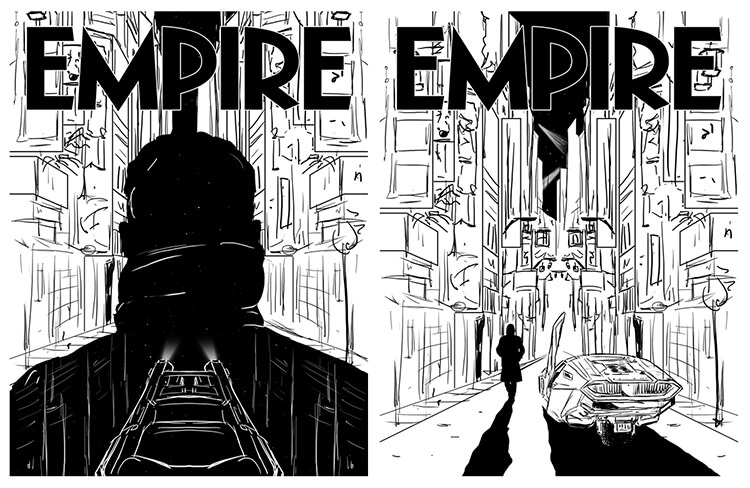
We really loved your recent Blade Runner cover for Empire Magazine. What is it about 80s movies and culture that inspires you so much?
We grew up in those years and the influence we get from that period is total. I’m talking about a visual aesthetic that marked the creative field in a clear way. Colours, typography and lights. We are so attached to that aesthetic that in the last few years we have bought on ebay 80’s toy packs to be put into our studio to get inspiration from the packaging and also to play with them again… obviously! ;)
It seems like you’ve worked on just about every huge pop culture brand we can think of – a personal favourite of mine being Back To The Future. Do you have one project in particular that really blew your mind when it landed on your desk?
There was a project that somehow allowed us to experience a new artistic road.
When they asked us to attend an exhibition in San Francisco where they hired Stanley Kubrick. He was obsessed with symmetry and perspective in his shots, and we decided to force this concept into our designs (The Shining and 2001: A Space Odyssey). It was a revelation! We then tried to bring this concept to other pieces too, which was fun! Thanks Stanley!


Van Orton’s designs for The Shining and 2001: A Space Odyssey
Your work has an instantly 80s vibe to it – which is largely down to your choice of colours and patterns I think. How do you go about picking a palette for each new piece?
There is a colour palette but every time the approach is instinctive, and sometimes we create 3 colour versions of the same design and choose the one that convinces more.
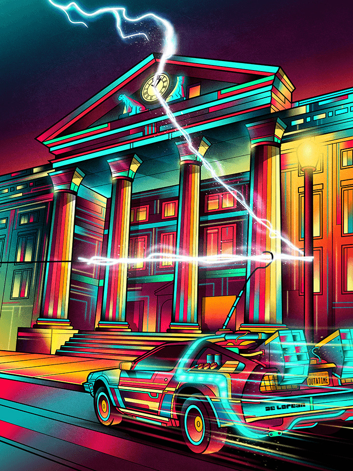
Van Orton’s Back To The Future design
Your Icons collection is like a window into every 80s kid’s brain. Will you be adding more to the collection? And if so, who / what are you hoping to illustrate next?
Ahah, it is true! Yes the collection is constantly updated in the most free moments. We like to add some kind of secondary childhood movie icons. The idea is to give it a second life, reinterpret it in a pop key and transform it into a modern icon of our time.
At the moment I do not know who’s next. But just take a walk in our studio library and we’ll surely find the next subject!
Some of Van Orton’s Icons collection
Who would win in a fight between He-Man, Terminator and Predator?
I think He-Man wins for his genuineness! :) But maybe he wins for us simply because they were our first action figures. We are loyal to Masters of the Universe. In today’s aesthetics I think it is very inspirational – the chromatic skeletor palette is amazing and the logo of the series is modern.
Apart from this nostalgic premise, in truth… Terminator sweeps them all away! :)
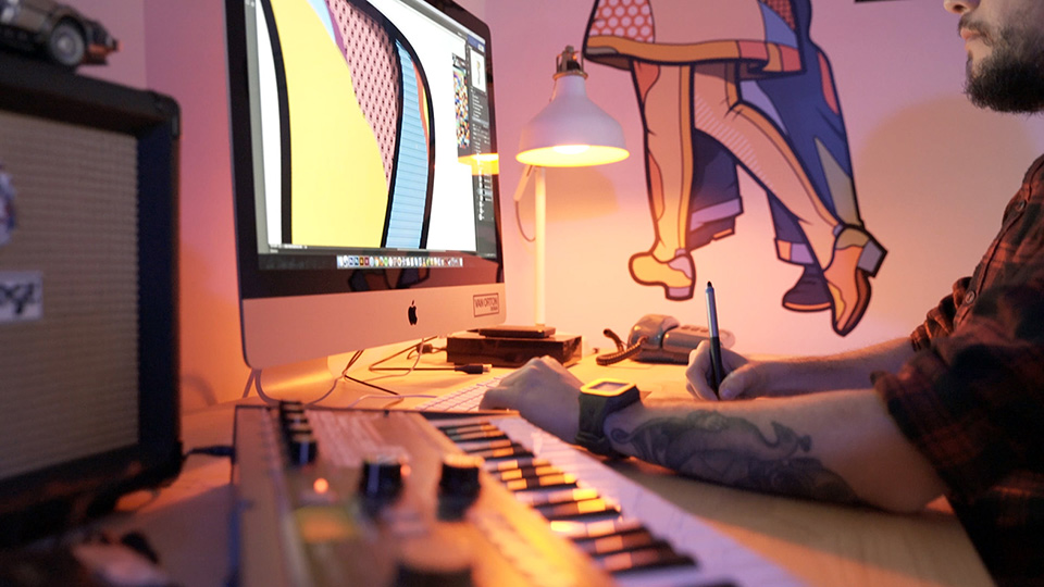
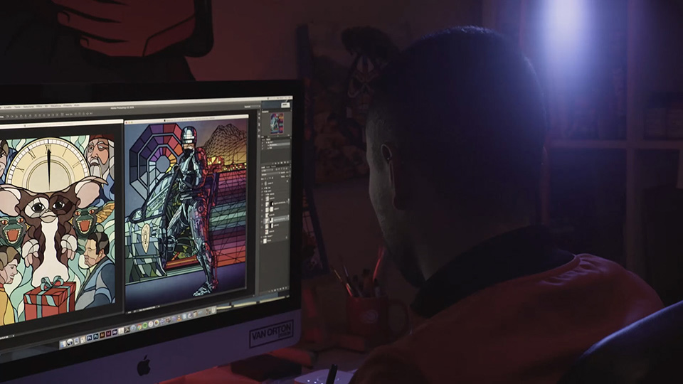
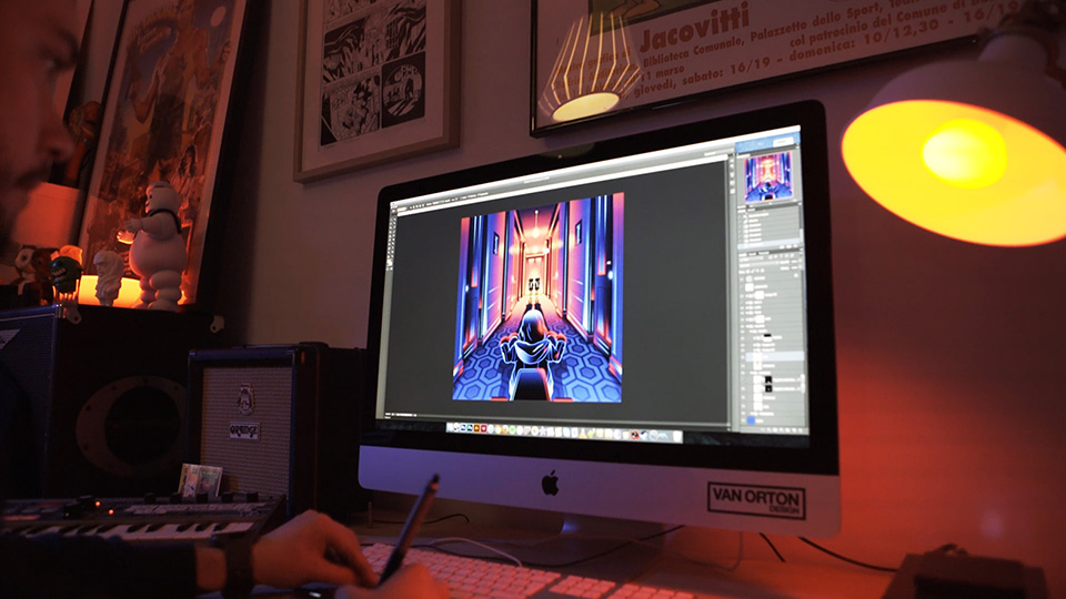
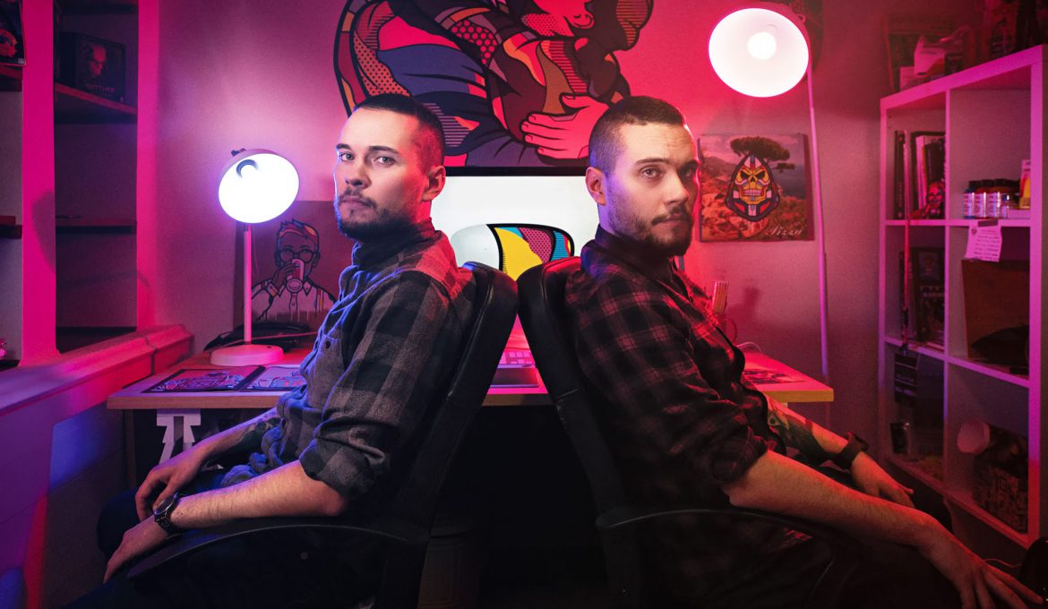
More photos of the guys hard at work!
What helps you stay creative throughout the day? Music? Coffee? Fresh air?
It’s not easy it is true. And counting that neither of us drinks coffee, we prefer walks in the country where we live, near Turin. It’s called Rivoli. Here is a castle that hosts an important contemporary art exhibition in Italy, and this place helps us to refresh the ideas. Then, in reality, creativity comes when you least expect it, and maybe just look at a shop sign at home and you can come up with an idea.
Do you have a favourite thing that you’ve bought in the last few months?
As children we were skateboarders. Now we do not skate anymore but recently we have bought decorative tables for our homes. And the series that Santa Cruz did in collaboration with Marvel is magnificent. So we got a couple of them. They are very good on the walls. And then I could add the Nintendo Switch and especially the new Zelda. I would say that there is nothing to add. Masterpiece!
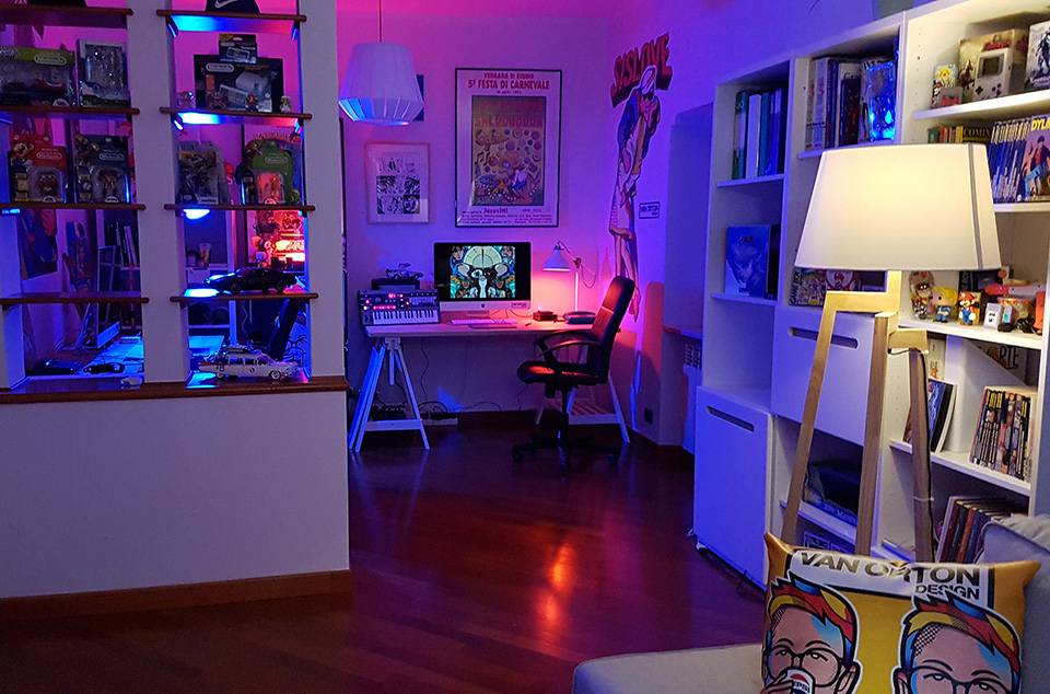
The Van Orton studio!
Finally, what’s the one thing everyone should do today?
It’s hard and so I put it on a lighter plane. And I say that everyone should watch the transformation scene in the Ghostbusters filmation series. It is a very visionary moment and extremely influential for me as a child, but above all, very fun. Look at it and find it inspirational!
Thanks to Van Orton for their time. Make sure to check out all of the work on their website and give them a follow on Twitter – @vanortondesign.
Posted by Jon Raffe
Liverpool-based digital designer. Still the reigning table-tennis champ, since we no longer have a table-tennis table!
