



TC Time Capsule: Part 1
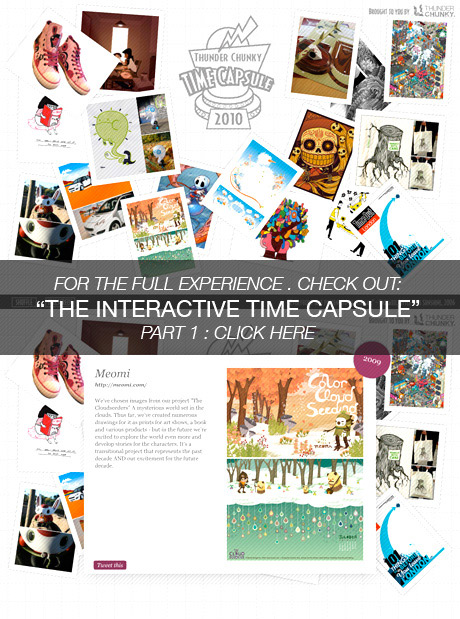
To mark the end of the Noughties decade we’ve decided to put together a time capsule of artwork to represent the last ten years. We’ve invited some of our favourite artists to hand-pick one piece of work they feel they would like to represent themselves and write a few words describing their choice. As you’ll see above, we have an all-singing, all-dancing interactive time capsule for you to enjoy, and we’ll be posting updates throughout the rest of December!
2006: Jeremyville

“I chose 2 colourways of my Converse x Jeremyville sneakers because I think they reflect my work in this period, and a shoe is always a good barometer of what was going on in that decade.
These are a collab between Converse and Jeremyville, and the 2 colourways came out in a limited edition available at select worldwide locations.”
www.jeremyville.com
2009: Pascal Campion

“This is a piece that represents 2009 for me and my family.
We moved to a new place, for good and not so good reasons, and it made us be closer , tighter and more in love.
I think this is the main event of 2009 for me.”
pascalcampion.blogspot.com
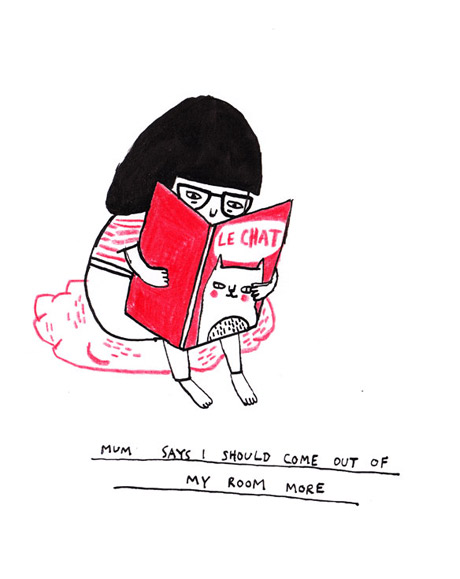
2009: Gemma Correll

“I chose it because I have played around with quite a few different approaches in my illustration work. A decade ago, I was studying for my GCSEs (wow, that makes me feel old!) and was still playing around with paints in art class and making an advent calendar in the shape of cat for my graphic design final project (OK, so maybe I haven’t changed that much). I’ve gone through various phases since then, some more succesful than others. But what I come back to every time is narrative illustration, simple in both theme and style. It’s what I enjoy the most and the area that I feel most comfortable working in.”
www.gemmacorrell.com
2008: Kev Speck

“The image I’ve chosen is called POPPY. It was created on brief for an agency this time last year for a pitch which unfortunately didn’t go to production. It was inspired for the festive period by a very special person and this is the first time ive ever shared it publicly (i was saving it for something special… its not even on my site yet so i guess its kinda an exclusive too!).
It was a proud moment for me to have such an oppurtunity and despite not being ‘successful’… i am very happy with the image and the work i did, plus the beautiful friends i made through the process, especially a lady called Shannon O’Quinn.”
www.kevspeck.com
2008: Piktografika

“To whoever reads this sometime in the distant future.
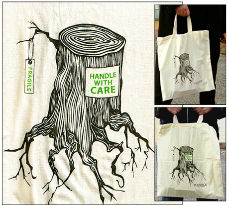
What you have found here is a canvas bag I made in september 2008. A fahion store in Stockholm invited six “young and promising” (heh!) illustrators to design its canvas bags.
I’m putting my bag into this time capsule for two reasons. The first is simply that I still do like this illustration. Some thought it was overexplicit but I like it. I imagine it is one of those pieces where I began to find my own voice as an illustrator. And, not least important, it got printed on bags that people actually bought. It was a damned nice feeling seeing people carrying my little bag around.
The second reason is that the topic of the illustration seems relevant. Environmental issues was very important at the time as we lived under the threat of global warming. This picture was an appeal – take care of nature now or there won’t be anything left of it soon.
I hope something positive have happened in the years between the end of the ’00s and the future you are living in. I hope you still have trees.”
www.piktografika.se
2006: eBoy

“We started with FooBar because we wanted to find a face for the place we live in the most of the time – the world wide internets. It was a domestic project with no clients involved and the launch of the poster produced a huge splash of attention for eBoy. The ladies in our shop had a hard time trying to get all the orders shipped. It was very exciting!”
hello.eboy.com
2006: David Cousens

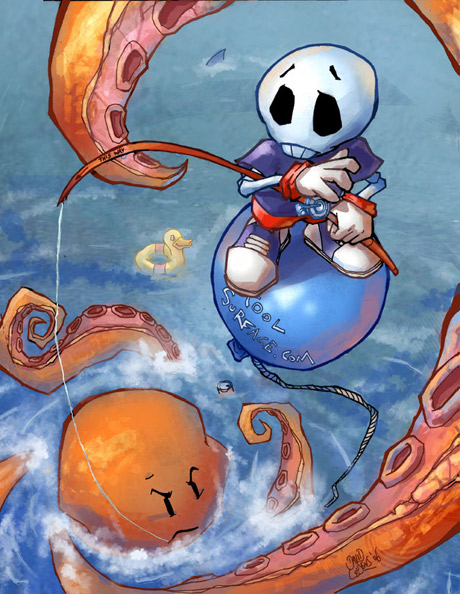
“Gone Fishing” was commissioned for Advanced Photoshop magazine #24 in 2006. I picked this piece as it was a bit of a milestone for me. It was the first tutorial I ever wrote and also my first piece of paid magazine work, commissioned hot off the heels of winning the “Best in Show” award for my entries in Advanced Photoshop’s ‘Peer Pressure’ feature in issue 23.
It was the first time I’d sent anything to a magazine and really helped kick off my career. Despite the fact I’d now change a lot about the image if I were to do it again, it still holds a special place for me as it was the first time working professionally in illustration seemed like a reality. Besides, part of the fun of time capsules is looking back at something in the future to see how much things have changed!”
www.coolsurface.com
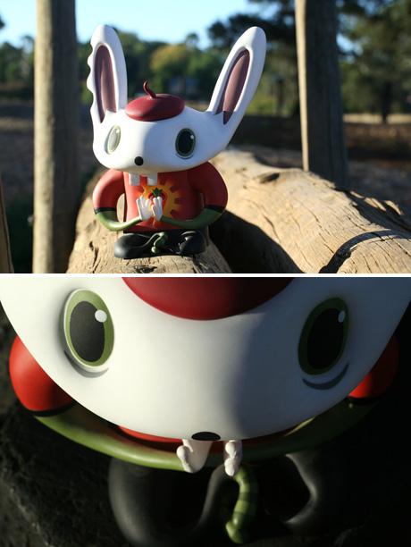
2003: Nathan Jurevicius

I had about 3 or 4 pieces I thought would have been good to show but possibly this one is maybe the best.
Bunniguru was the 3rd large (7 inch) vinyl figure I created with Hong Kong producer Flying Cat in 2003. It became one of my most successful pieces, spawning numerous other Bunnigurufigures that ranged from 3 inch mono’s to 36 inch pvc inflatables. 7 years later Bunniguru still remains popular and takes a lead role in the Scarygirl graphic novel, film development and a new mini-series in the works.”
www.nathanj.com.au
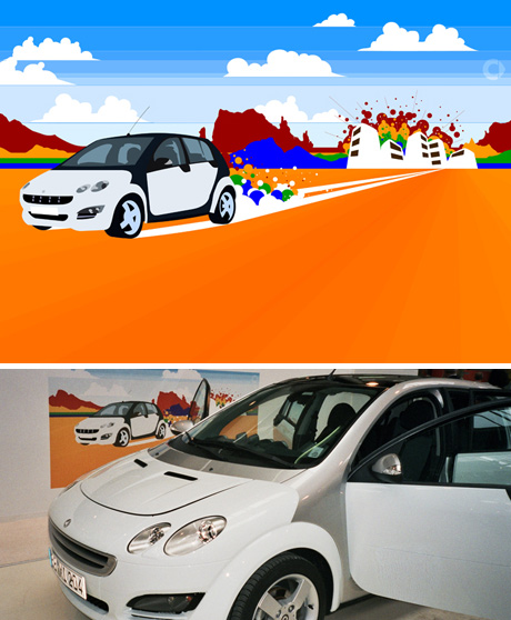
2005: Ben The Illustrator

This was a commission I did for Smart Cars back in 2005, it was my first proper commission working under the name ‘Ben the Illustrator’ (I’d previously been working as a creative director and illustrator in a small design studio) and it seemed to pave the way for my career up to today, but it’s also important to me as it completely turned my thought process and my view on commercial design and illustration on
it’s head, I’d never before just forgotten about the current trends and what’s already percieved as ‘cool’ and just gone with my heart, created so purely and with such clarity!
Prior to commissioning this, Smart Cars had only ever had photographic adverts, they were taking a big risk and being very forward-thinking looking to an illustrator, it was a pretty exciting prospect for me, since then they’ve gone on to commission a great number of illustrators and designers, but I was a guinea pig for the client, it was purely an experiment for them, it was my first commission since leaving a stable and secure job, I was thrown out there, but to be honest I felt so free and unrestricted, I had nothing to lose.
They knew they wanted an illustrated landscape, the car leaving a city off on an adventure, and I’d started with a much more natural, realistic scene, but I knew it wasn’t enough, they could have achieved the same with a photo. So, I created some new landscapes to play with the possibilities, I knew I wanted to throw a rainbow in there for a blitz of colour, but why not make something of it? Why couldn’t the rainbow BE the landscape? The client loved what I was playing with, but it was still an advertisement, essentially we still had to sell a car, so we decided to keep the car more real, you’ll see here that it’s actually traced from the photo, keeping it perfect in form, keeping it instantly recognisable. I kept on playing and struck upon the idea of instead of the car throwing up dust, it would throw up bubbles, colourful bubbles, an idea I’d had at a Flaming Lips concert a few years before (they unleash a mass of inflatable coloured balls on the crowd, like massive bubbles), and finally it all came together as one succinct, exciting advertisement, by me, for Smart.
The image went on to be used in print adverts and at trade shows, but it also led to a 3 year campaign with Smart Cars worldwide, it led to me defining my style as an illustrator, it led to me proving myself as a commercial designer and signing with a good, forward-thinking illustration agent, it led to me becoming a stable business working alongside my wonderful wife Fi, but most importantly this particular illustration installed in me the ethic of always trying to create something new, something different, something exciting, taking a risk and being true to my heart.”
www.bentheillustrator.com
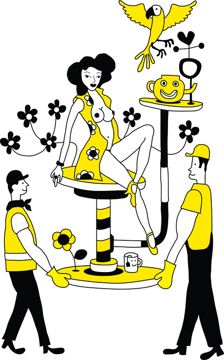
2008: Al Heighton

“I’ve chosen this image that I’ve produced this year – “Here Comes”. Why is it one of my favorite images? At the beginning of the noughties I laughed and joked with mates and family that if I wasn’t an illustrator I’d have been laying tarmac or even working on the rails in overalls and a high viz jacket with a flask of tea and a red top paper of choice.
I love working class heroes and here are two pictured; everyone loves a dame. Here you have two working class lads bringing that dame on to applaud. This image was hand drawn then scanned, redrawn digitally, then produced as a limited edition screen print. Out of the images I’ve produced somehow this one still makes me chuckle and in a funny way it feels very “Al Heighton” and stands for everything I’m about. I hope with every image I produce, or every blog entry I make, entertains someone or makes them smile.”
www.alanheighton.co.uk/
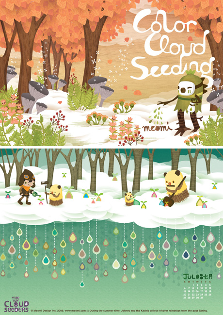
2009: Meomi

“We’ve chosen images from our project “The Cloudseeders” A mysterious world set in the clouds. Thus far, we’ve created numerous drawings for it as prints for art shows, a book and various products – but in the future we’re excited to explore the world even more and develop stories for the characters. It’s a transitional project that represents the past decade AND our excitement for the future decade.”
meomi.com
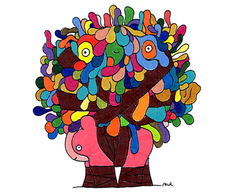
2008: Steve Rack

“I’d like to place King Soso & Dibbo into Thunder Chunky’s noughties time capsule. Why King Soso and Dibbo? Well, the creation of King Soso and Dibbo was a turning point for me, and the characters pretty much some up my work: colourful escapism and imaginative fiction.
I created King Soso and Dibbo in January 2008. Not a great amount of time ago, but long enough for a lot of cool stuff to happen between then and now. I designed the characters initially for the home page of SUBvert Magazine.com. That was a real buzz. My illustration replaced one by Jeff Soto; an artist I greatly admire and was lucky enough to later meet, along with SUBvert Magazine’s Angel (on my birthday, of all days). From a career point of view, these characters kind of started a snowball effect for me. Realising that others enjoyed my characters as much as I did really inspired me and helped me believe in myself as an illustrator. And that self-belief allowed me to realise new opportiunities. So really, King Soso and Dibbo actually mean alot to me on a personal level. I have the original illustration stashed away in my treasure chest of character illustrations.
King Soso and Dibbo come from a place many of my characters come from that make up much of my self-initiated artwork. I guess you could call that place Racktopia; a land of colourful, chaotic, cute and cheeky characters.
I also use the image a lot for my icons on social networking sites like Twitter, Concrete Hermit ( http://www.concretehermitnetwork.com/) and more recently, Doodlers Anonymous (http://www.doodlersanonymous.com/).
Thanks ThunderChunky for accomdating King Soso and Dibbo in your time capsule!”
www.steverack.com
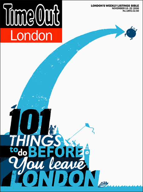
2006: Andy Smith

“My favourite piece for the 00’s is probably this. It was a cover for Time Out. It was the first illustrated cover Time Out had commissioned for ages and turned out to be a big seller. It was done in 06 when I was starting to do a lot of type work and following this an awful lot of people wanted something similar. I really like the simplicity of it with a lot of white space in it. I have some of the posters that they gave out to news stands and it looks great big. Funnily enough I got this job just as I was thinking of leaving London. I didn’t get around to doing any of the 101 things though…”
www.asmithillustration.com
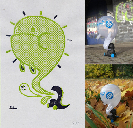
2006: Peskimo

“Monster Burp is a creation that really has taken on a life of its own. It began as a little sketch, which became a small print for a group exhibition, we never considered back then that it could be sitting on our desk as 3-D vinyl toy. It just goes to show that sometimes the best ideas creep up on you. When we suggested some ideas to Crazy Label, Monster Burp was one of the pictures we put in as a reference, we weren’t thinking it could become a product. But when Andy Woo showed interest in the picture, we all began seeing it as a challenge to turn this very unlikely and organic image into a toy that remained true to its origins.
It took a few goes to get the balance and form of the figure right, but we were so thrilled with the results and have had such a positive response from people who now own it! We’ve chosen Monster Burp for the time capsule as we think it really encapsulates the whole process and union of illustration and vinyl that seems to have exploded in the last decade, and we’re really proud of it! Merry Christmas and happy 2010s!”
peskimo.com
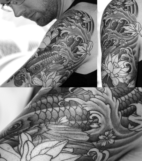
2006: Ollie Munden

“When trying to decide which one project really stands out as my favourite of the noughties, I found there were plenty to choose from. Whether it be through my work as Lead Designer at McFaul Studio or one of a few bespoke murals that I have had the pleasure of painting…. it was tricky to pick the best.
However, non seemed more appropriate than something I designed which cannot be erased, cannot be removed from the folio and cannot be tucked out of sight. This Japanese style (soon to be) half sleeve tattoo was laboured over for months. Eyes were changed, scales redrawn, new flowers added and removed, opinions received – considered – dismissed and listened to. It really was a labour of love. It had to be though – this image will stay with me forever and I’m happy to say i like it… and those who have seen it also like it.
This piece, along with a handful of others, has led me to build quite a queue of Tattoo commissions… so keep your eyes peeled moving into 2010 for more tattoo artwork from me.
I owe a HUGE thanks to Phetrus of Kings Cross Tattoo Palour () for inking this for me.”
www.megamunden.com
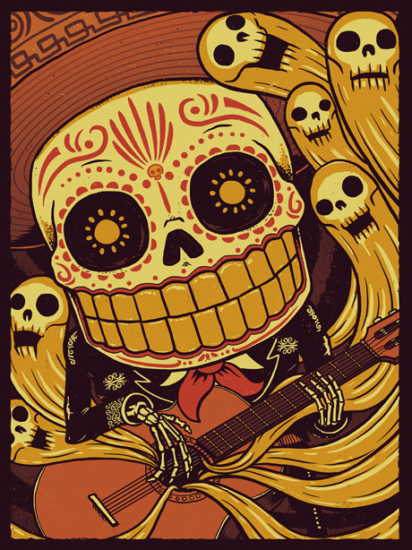
2009: Derek Deal

“So this is actually a newer piece of mine. I’ve been really fortunate these last few years of the decade, having the opportunity to work with a slew of amazing clients on some killer projects. Each one has been challenging and rewarding in their own way and has served as an invaluable benchmark in my journey of becoming a career illustrator.
As the ’00s have begun to wind down ive found myself wanting to explore my own ideas and concepts more and more and desiring different venues for exhibiting my work besides strictly commercial ones.
This particular piece is one of my first forays in that arena. It was shown as part of a group show themed around Dia De Los Muertos at HOWL gallery in Fort Myers, FL. Though there were guidelines for the show, it was the first time I was allowed to play in a bigger sandbox so to speak while also being able to present my work to a completely different type of audience. Im submitting this particular piece, Mariachi De Los Muertos, to the thunder chunky timecapsule as a celebration of new beginnings and opportunities in the coming decade….save for some galactus-like mayan diety showing up in 2012 and devouring the planet like a fat kid inhaling a little debbie.
The original Mariachi De Los Muertos is a 18×24 gilcee on archival water color paper and I have 18×24, 4 color screen prints available for purchase on my website.”
www.derekdeal.com
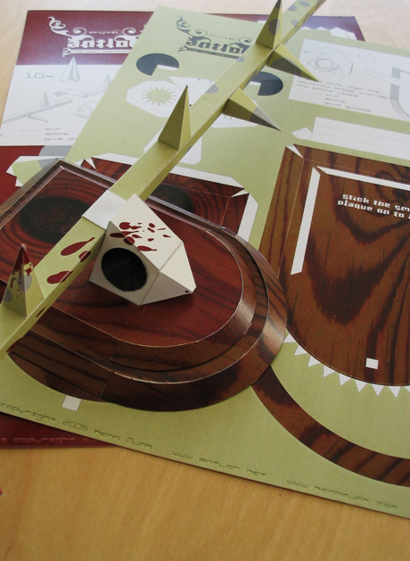
2005: Kenn Munk
<
“I thought about sending some recent stuff because my work has changed a bit throughout the naughties. In the end I went for my Antlor project from 2005 (still have some left) because that marked the beginning of my company and the shift from using my skills to do sales displays and packaging and mediocre ad campaigns to something weirder. Financially Antlor where a disaster, but mentally they were a great success. So slap-bang in the middle of the decade.”
www.kennmunk.com