Here at TC we’re huge fans of Better Call Saul, the (arguably better.. is that just us??) spin-off from Breaking Bad. And we were made up to get the opportunity to talk to Alan Chao, who worked on the show as a graphic designer. He was kind enough to give us a glimpse into the world of graphic design within the TV world…
Here at TC we’re huge fans of Better Call Saul, the (arguably better.. is that just us??) spin-off from Breaking Bad. And we were made up to get the opportunity to talk to Alan Chao, who worked on the show as a graphic designer. He was kind enough to give us a glimpse into the world of graphic design within the TV world…
Hi Alan, welcome to Thunder Chunky. How do we find you today?
Hi TC, thanks for having me. Today I’m found behind my computer at work. Sometimes I’m in my sketchbook at a cafe. Occasionally I’m prowling the streets exploring.
What does a usual day-in-the-life of Alan Chao consist of?
I’m usually busy working on a production, lately it’s been television shows. In a usual day, I start by going through my notes and begin prioritizing what needs to be done; crossing off hand-written notes is so satisfying. I try to stay balanced and manage my time well. I must be able to maintain a creative workspace as well as logistical workspace. I have things that need designing and designs that need producing.

Alan’s Better Call Saul logo in use on a promo banner
We came across your work as a result of your work as a graphic designer on Better Call Saul. Pretty sweet gig! How did the opportunity come about?
I work regularly within the Art Department in the film and television industry here in Albuquerque, New Mexico. Around the time Season 1 of BCS began production I was asked to be a part of the project.
There will be a lot of graphic designers out there who I’m sure would be envious of your role on such an iconic show – what does the job entail?
The job entails creating a variety of designs to help guide the story in the right direction. This can be anything from a jello cup with a familiar lawyer’s face at the bottom, to a dilapidated motor lodge billboard on the side of the highway. Even posters and artwork for background set dressing. It is often an almost transparent result, creating the reality for the director, cinematographer and actors to live and shoot in.


Concept and final version of a roadside sign
Am I right in thinking you actually designed the Better Call Saul logo? If so, great work! What was the process you went through on it – I’d imagine the showrunners and creators probably wanted to have some input on it?
That’s right, I did design the BCS logo, but I never knew it would go as far as it did. Just as any design, this went through vigorous drafts and revisions. I worked with the Production Designer in figuring out the right look to establish for the show. I originally presented various hand lettered type all conveying a fun and whimsical feel.
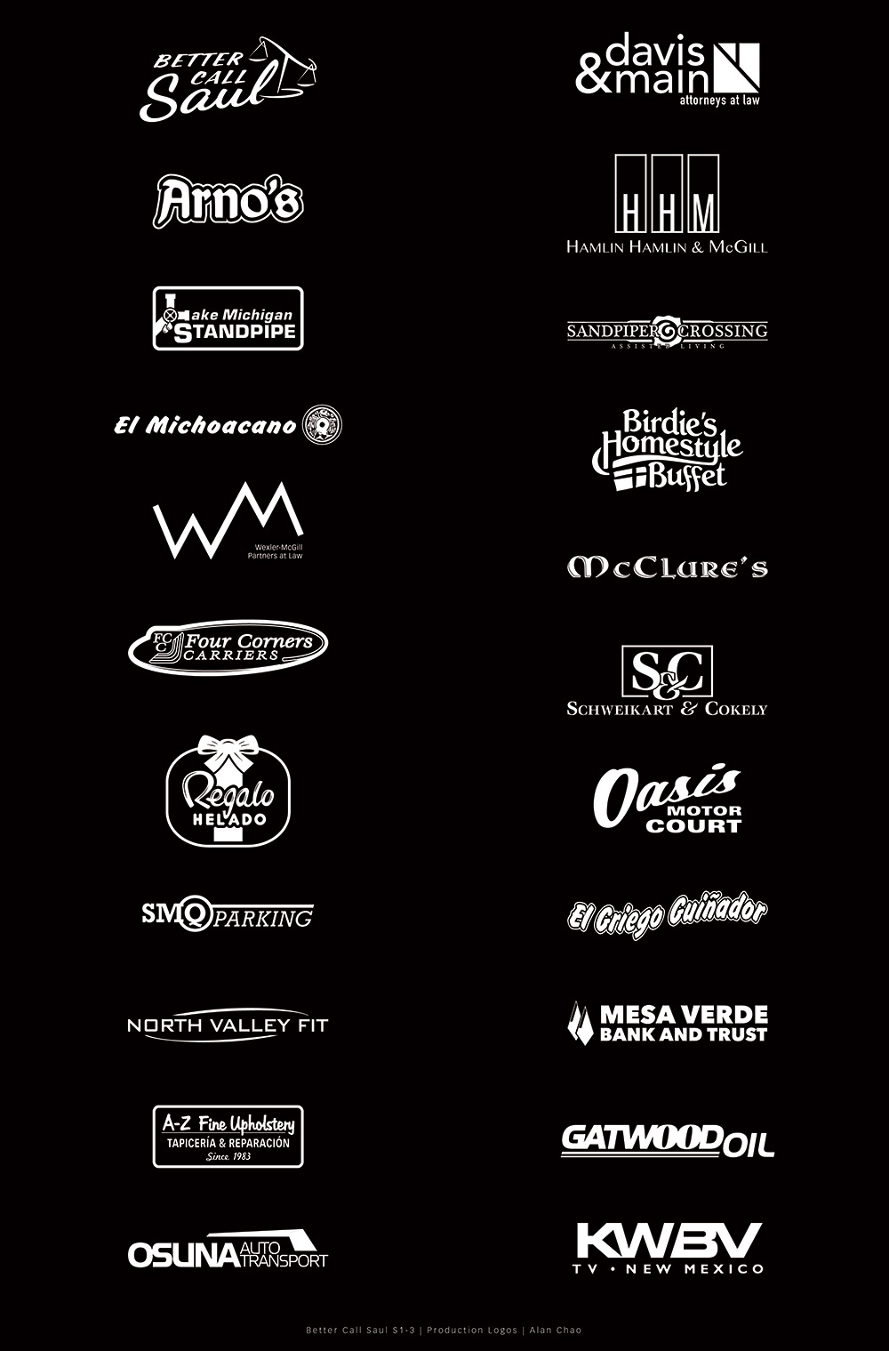
A selection of Alan’s logos that appear on Better Call Saul
The design process began taking too long so we started exploring and adapting a combination of other typefaces and eventually decided on the resulting logo. The logo I create for a show is usually just for shooting production; for letterheads, vehicle placards, and crew t-shirts. It is usually later that a show develops and brands a logo for marketing and identity but the showrunners and creators seemed pleased with the logo and it made the final cut.
Could you talk us through the process of a typical design task – where the brief originates, and how it ends up on screen?
It all starts with the script. After it is broken down by the Production Designer, Art Director and I, I get further details and instruction on what to start designing for. I begin gathering research and start to develop some rough concepts.
I like to start with rough pencil or pen drawings, usually on any scrap or recycled piece of copier paper. If I have time to take a project home, I’ll sketch in my book. I’ll find something I like and then start to work on the computer to produce finer renditions of these concepts. I then present options to my Production Designer. We find something he likes, or revise something he doesn’t, and then it gets passed onto our showrunners for review. This process usually goes through further revisions until it is finally approved and produced and made camera ready.


Alan’s sketches and final on-screen design for the jello pot
What sort of things have you found yourself designing across the series?
I’ve designed logos for law firms, signs for storefronts, posters for a health clinic, patches for uniforms, ADA compliant signs, highway and road signs, engraved plaques, a Cinnabon mural, magazine covers, a shoe box, a taxi cab, and a milk truck, just to name a few.
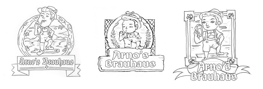
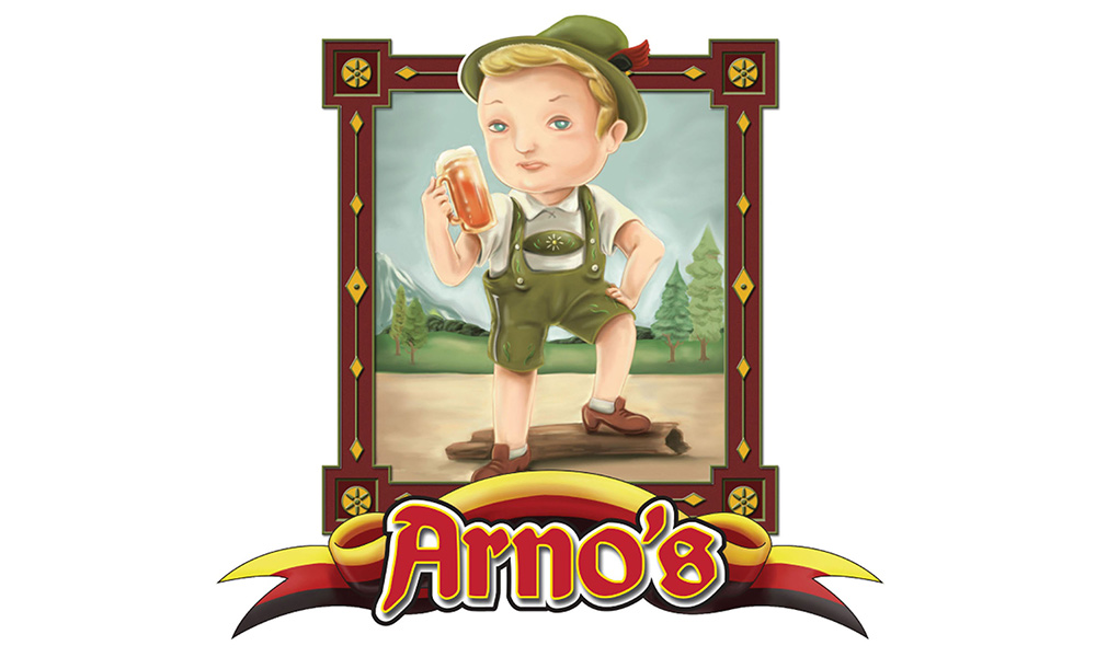

Design for a logo for a bar called Arno’s that Saul visits in Chicago
Do you have a particular thing you designed on the show that you got a real kick out of?
There’s definitely a few, one of them would probably be the ice cream shop sign in Season 2. It features an ice cream character we called Little “Sabrosito” (Little Tasty).
He was later turned into a bobble head for a car dashboard.


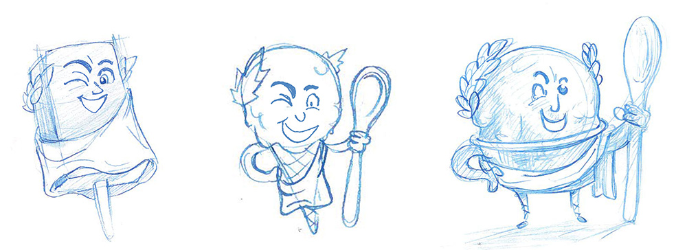


Development of the ice cream shop signage and the Little Sabrosito character
What would win in a fight… a pencil, a pen, a paintbrush or a stylus?
I guess it depends on what you’re fighting for and why… For me, when working on a demanding production, the stylus reigns. When writing notes, the pen is supreme. If I’m blocking in structure or laying out a rough idea, pencil is king. When hand lettering or sign painting, the paintbrush is unmatched.
Do you have a favourite thing that you’ve bought in the last few months?
Not really… I restocked on brush pens. My favorite is a Kuretake disposable brush pen. It’s cheap and I find it has a great nib for drawing and writing.
Finally, what’s the one thing everyone should do today?
Learn a new trick. Oh, and buy local art.
Thanks to Alan for his time. Make sure to check out more of his work over on his site. Oh, and check out Better Call Saul… of course!
Posted by Jon Raffe
Liverpool-based digital designer. Still the reigning table-tennis champ, since we no longer have a table-tennis table!

Alan's Better Call Saul logo in use on a promo banner


Concept and final version of a roadside sign

A selection of Alan's logos that appear on Better Call Saul


Alan's sketches and final on-screen design for the jello pot


Design for a logo for a bar called Arno's that Saul visits in Chicago


Development of the ice cream shop signage and the Little Sabrosito character


